Skyview Dashboard
The Skyview dashboard provides multiple interactive widgets that allow you to easily view and compare data from TickeTrak all in one place. The Skyview icon in the navigation bar will take you to the login screen for this service.
The Enforcement section contains information about Tickets issued and all related data, including officers, locations, and outstanding amounts.
The Finance section contains information about overall outstanding balances, as well as information and metrics on Appeals.
The Permit section contains information about Permits issued and related data including recently expired or imminently expiring Permits and Permit type information.
Charts, Graphs, and Visual Aids
There are several kinds of charts and graphs that appear in Skyview.
Line Graphs
Line graphs are primarily used to show data trends over time. This example shows the number of Tickets issued per month over the course of a year.
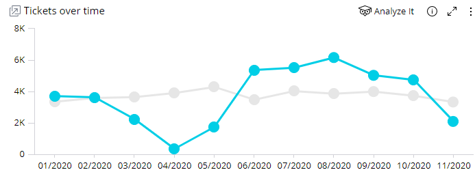
Line Graph Sample
The blue line is the current year. The gray line behind it is the previous year for ease of comparison.
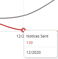
Hidden Node Sample
Some graphs will be zoomed out enough that the nodes will not be visible automatically. Hover over the graph to make nearby nodes appear.
Bar Graphs
Bar graphs are used to show comparable data across different criteria. This example shows outstanding Ticket amounts across time, with a distinction between Fines and Fees.
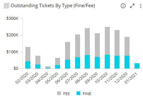
Bar Graph Sample
Bar graphs can be vertical, as shown in the example, or horizontal. They can have multiple data sets stacked on top of each other, or have a single amount shown.
Pie Charts
Pie charts show data as a visual percentage of a whole. This example shows the colors of vehicles that have been issued citations.

Pie Chart Sample
Clicking on the Others section will bring up a new pie chart that only shows the data that was classed under Other.

Pie Chart - Other
Click on the Back button in the upper right of the chart to return to the main pie chart view.
Treemap Charts
Treemap charts show proportional data within a given data set. In this example, all of the Grant Actions used are shown.

Treemap Chart Sample
Different sections of the chart may be the same color or different, depending on the data being presented. Sections with the same color fall under a single parent umbrella. In the case of the above example, that umbrella is “grant actions”. A chart showing all appeal actions, for example, would have “deny actions” in a different color.
Clock Charts
Clock charts show the distribution of data throughout the day. The example shows the time of day when Tickets were issued.

Clock Chart
Maps
Maps show where Tickets have been issued. Due to their size and complexity, only data is shown on the main Dashboard. Click on Go To Map to view the map itself.

Go To Map
The map will automatically zoom in to a relative area where all of the data points can be seen. Click and drag on the map to move it around. Click the plus and minus icons or scroll up and down to zoom in and out on the map.
![]()
Zoom Icons
Filters on the right side of the map can be used to adjust the data shown.
Each data point on the map shows an exact location where Tickets have been issued. In most cases, each of these points will show only one Ticket. However, multiple Tickets can be issued and recorded on the same spot.
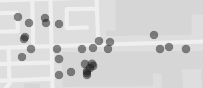
Map Section
Hover over a point to view the exact latitude and longitude of the point, as well as the number of Tickets issued there, the fine on those Tickets, and the Ticket numbers.
Controls and Options
Filters
Filters can be applied to all of the data shown on the page. The Filers menu is on the right hand side of all dashboard views. It scrolls separately from the main dashboard, so you can edit the filters without losing your place on the dashboard.

Filters Sample
When you hover over a filter option, a small arrow will appear to the left of most options, and a pencil icon will appear on the right. To adjust a filter, click the arrow to open the options listing in the sidebar, or click on the pencil icon to bring up a larger window. Filters with a large number of options can only be changed through the window version.
To turn off a filter entirely, click the dot slider icon at the lower right of that filters box. This will switch it off and gray it out. To turn it back on, click the icon again.

Filter Menu
To clear all of the filters and return them to their default state, click the circular arrow icon at the top right of the sidebar.
If you wish to change the default settings, simply set the filters as you want them to appear then click the three dots icon at the top right of the sidebar. This opens up the filter menu. Click Set as My Default Filters to save the current settings.
General Options and Controls
All widgets have a small menu bar that appears in the upper right corner when they are hovered over.
![]()
Widget Menu
Clicking the ‘i’ icon brings up more information about that specific widget and what it shows.
Clicking the arrows icon opens the widget in a new page, allowing you to view a full screen version of it. You can drill into this view of the widget and then either clear or apply the changes made to the full dashboard when you return by clicking the applicable button.
Clicking the three dots icon brings up other available options. The primary option is to download the contents of the widget as either an image or a CSV file.

Hover Sample
All graphs will show additional, more detailed data when you hover over a section of them. Click on a section to filter all other relevant graphs to match the selected data. Note that the graph that was clicked on will not change.
![]()
Clear Selection
To clear this filter, click the Clear Selection option that appears at the top of a widget when a section has been selected.

Node Right-Click Menu
Right click on any section of a graph or charts to view options to look deeper into the data available. Some charts may not have all of these options.
Select uses the section data as a filter and updates all of the other widgets on the page to only reflect that data. This is the same as clicking on a section.
Drill allows you to drill deeper into the data in the widget. In this case, the Issue Date drill will update the graph to show data for all of the days of the selected month.
![]()
Drill Information
When drilled, text will appear in the upper left of the widget, showing what has been drilled into. Click the X icon in this to back out of the drill.
Jump To opens a sub-dashboard with more information about the data counted in that section.
Was this article helpful?
That’s Great!
Thank you for your feedback
Sorry! We couldn't be helpful
Thank you for your feedback
Feedback sent
We appreciate your effort and will try to fix the article